There is a lot of discussions around using single pigment paints vs multiple pigment paints. So I wanted to study all of the colors offered by one company to understand how a range of colors is made. Yup, I am a little nerdy and obsessive when searching the answer to a question of mine! 😉
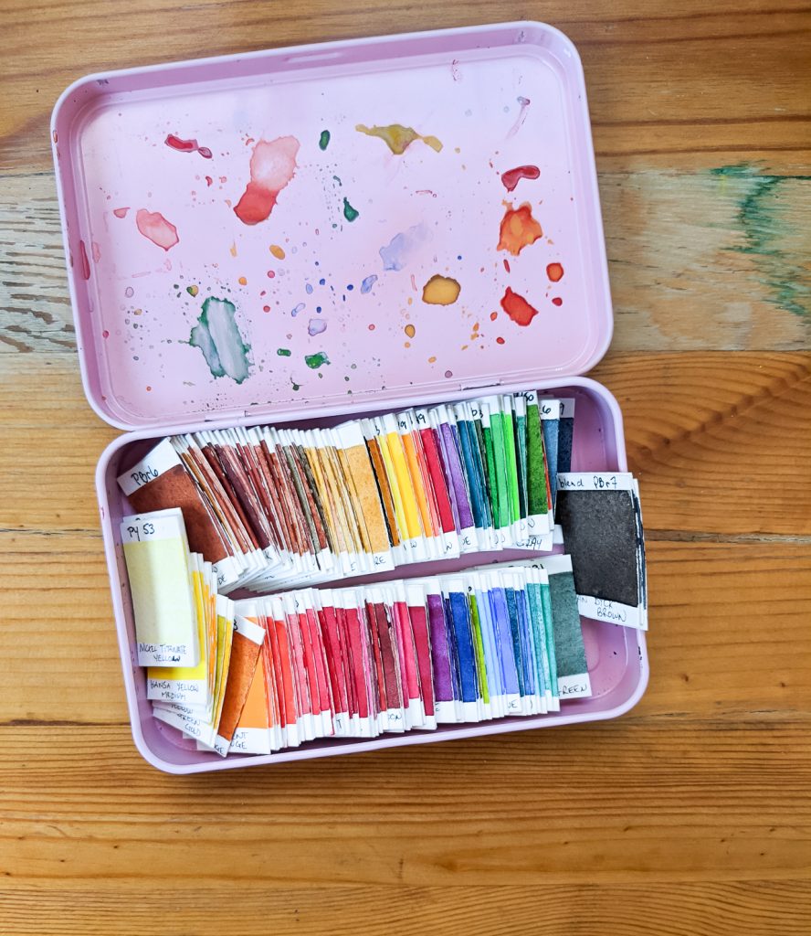
I won’t get into the whole discussion of single vs multi pigment colors today, I simply wanted to share a project I made with my little swatches. But if this topic interests you, here is a great read about Why you should (or should not) stick to single pigments in watercolor? by Lee Angold.
This post is a way to share my explorations, it is not quite a theoric explanation of color mixing! So please enjoy it with its qualities and limits. 😉
This posts contains some affiliate links that are identified as such. If you buy something from these links I will earn a small commission at no extra cost to you.
Main objectives : Saving money and Color study
The main idea I wanted to explore was the following: in theory, if you buy the single pigment tubes of paints, then surely you should be able to mix all the other colors in a company’s range of paints, thus saving money. Right? Well yes and no!
My second goal doing this was to get a better understanding and knowledge about colors. When I started Huevember by Denise Soden, I was amazed to learn that Sap green was not a single pigment color, but that each marker and brand seemed to have their own recipe for it. It got me wanting to learn more.
The project : using the Daniel Smith’s Dotcard
So I wanted to see if I could do this using my Daniel Smith’s dot card (affiliate link). I had already used the sample dots to see the colors, but I was searching for a fun project to make with the rest of the dots. And for many colors, there are that much, so the project had to be small!
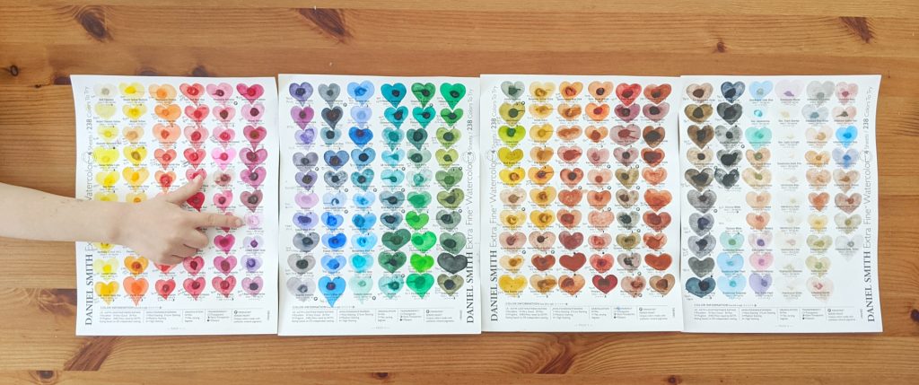
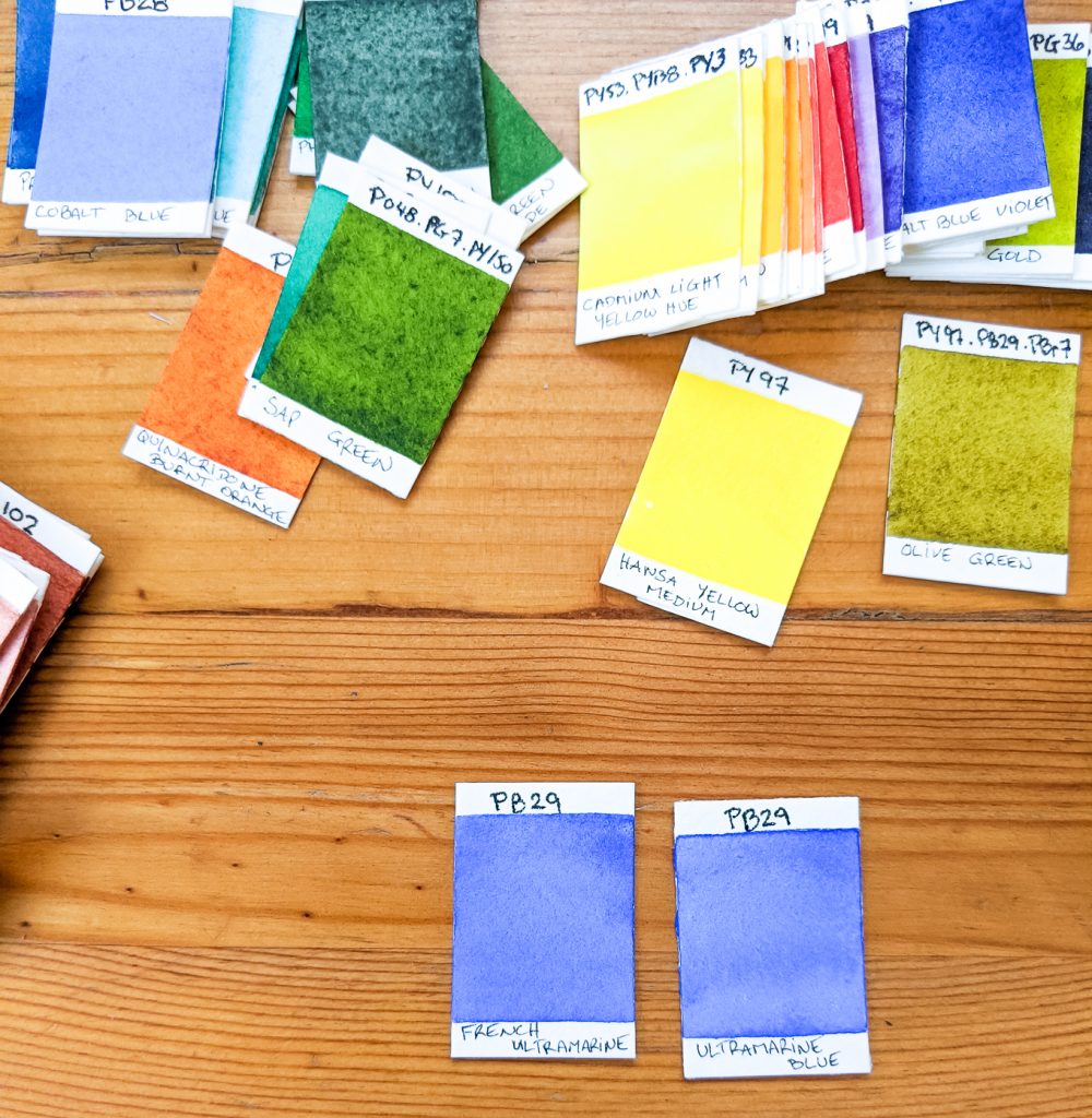
I first printed out the color chart for all 238 Daniel Smith’s watercolors. It has the pigment info on them. And then, proceeded to paint small swatches on Legion Stonehenge (affiliate link) 1 inch by 1 1\2 inch little rectangles.
It was a bit of a long adventure, but I did appreciate the exercise. Though the size of the swatches is small, it is big enough to give you an idea if you appreciate painting with that particular color.
I ended up with a great result. Go check my Instagram posts about them to see the little cards all lined up by color.
Being the nerd I am… the first thing I tried to make what a sort of map of all the colors in a somewhat color wheel way… My plan was to put the single pigments and under them, the mixed ones. It worked well with yellow/oranges/reds…. but the bottom half of the page ended up a bit too crowded. In the end, it did help me study the colors. I have plans to transform this into a colored version…. will be much more interesting. 😉
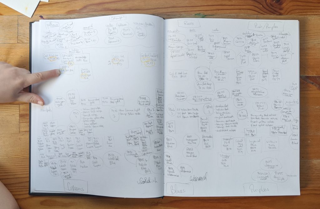
(My daughter loves to put her hands in the pictures I take!)
Single vs Multiple pigment hues
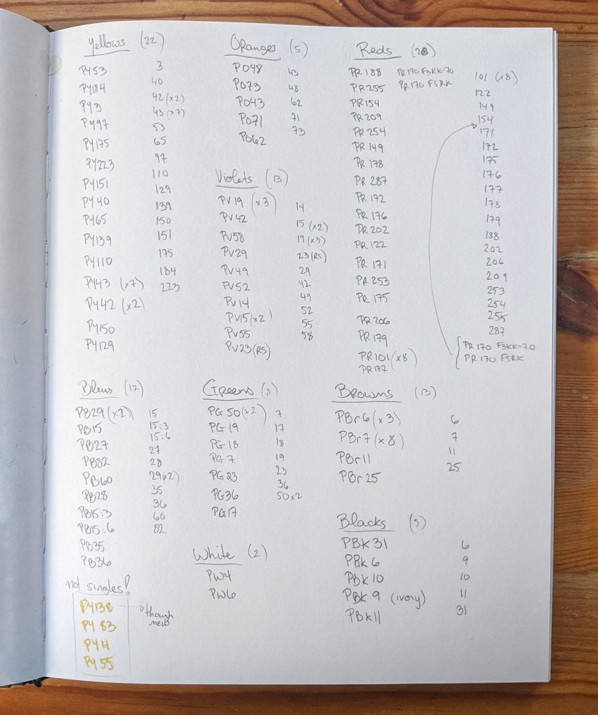
I looked at single pigments. Throughout the collection, I noted every pigment that was used. Interesting fact, 4 pigments (noted in the bottom) were not available as single pigment colors. There goes the “you can mix any colors with the single pigment colors”. Of course, there is the possibility I made a mistake. ahha!
Then, I looked to visually put all the single pigment paint swatches together. On the following pictures, the top row are mixed pigment colors. The bottom row are single pigment colors. I was surprises to see there were many more of those than of the mixed pigments!
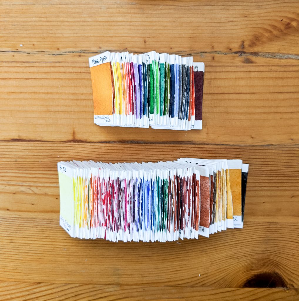
Multiple pigment hues
So in my sketchbook, I also planned, with some examples, how to visualize mixed pigment hues.
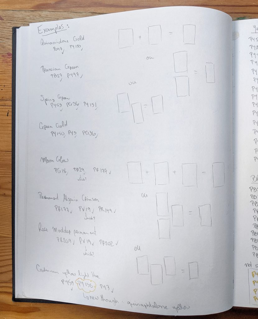
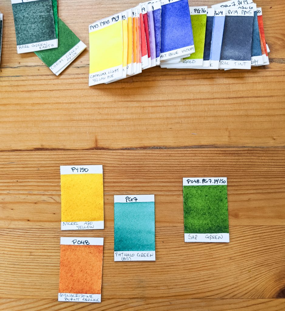
The easiest combination: two colors making a third. That is pretty straight forward. This is the case for the famous Quinacridone gold, which is made with a mix of P048 – Quinacridone burnt orange and PY150 – Nickel Azo Yellow (one of my favorite colors!).
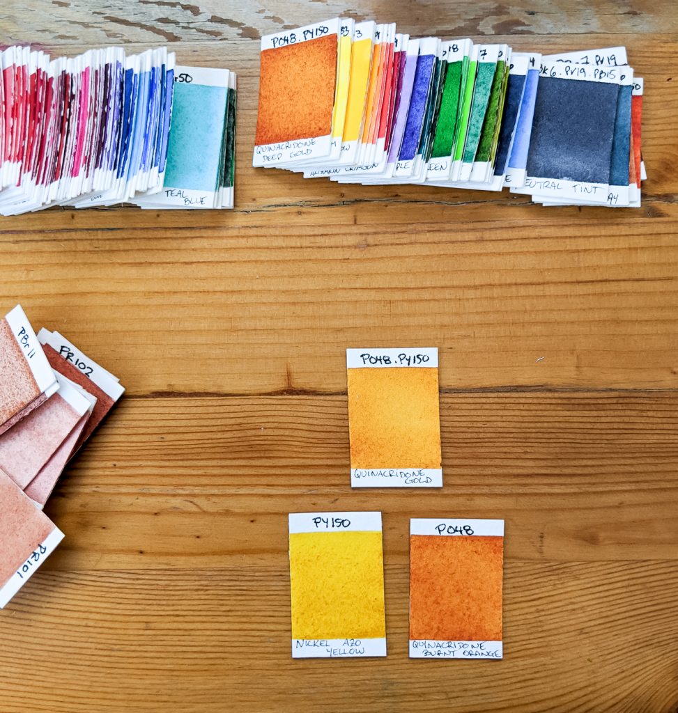
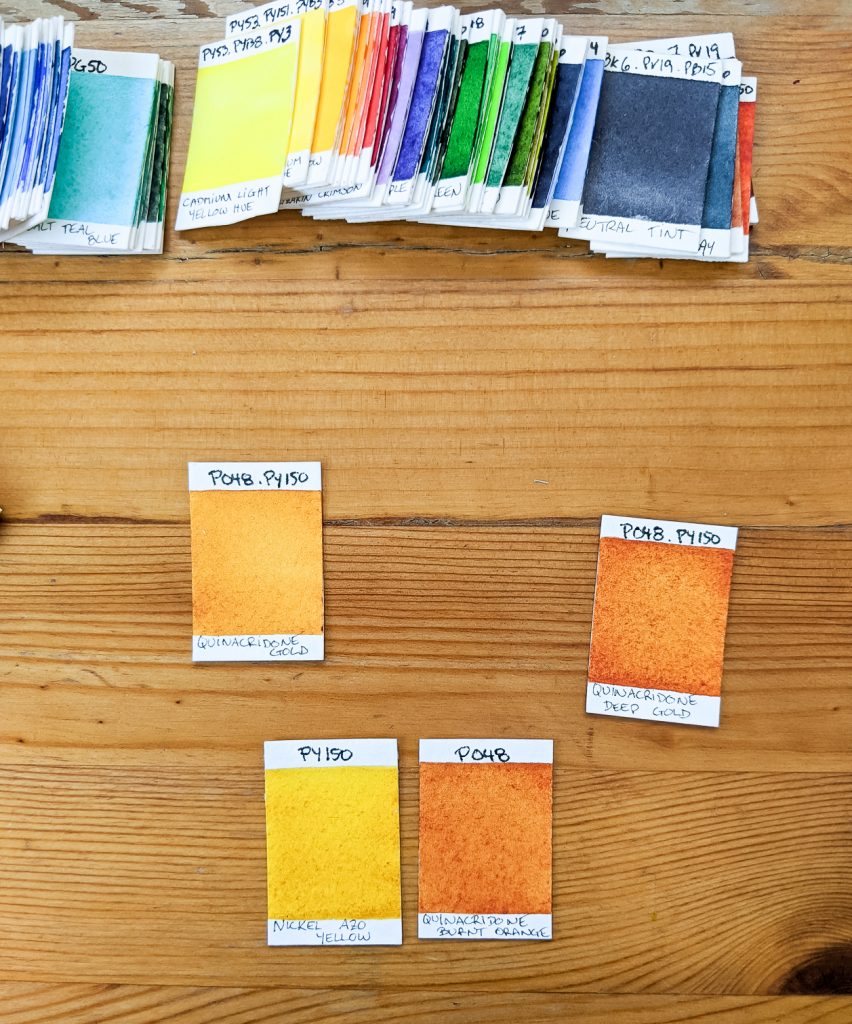
But then you realize sometimes, two colors make more than one mix. That is the case with the PO48 and PY150, which are also used to make Quinacridone deep gold. Oh well then…. that is good news because that means if I buy tubes of two colors, I can then mix 4 of the colors of the range. Very neat!
And then, I started to look at more complicated colors, which use more than two single pigments. And that’s where it gets interesting… though a little confusing!
Lets start with a simple one : Sap green. I had mentioned in at the beginning of this post. Daniel Smith’s sap green is made out of three pigments : P048 – Quinacridone burnt orange, PG7 – Phthalo Green and PY150 – Nickel Azo Yellow. Now that might get a little more complicated to mix on a regular basis to the exact shade.
Which is why those mixed pigment colors are often called Convenience mixes. If you use them a lot, then by all means, buy a tube because you might turn mad trying to reach that exact shade every time you feel like using that hue.
Multiple hues in single pigments
When I started to get interested into color theory I learned about pigment numbers. I thought I had the key to something: well there is a pigment number, this must mean that all of those pigments are the same hue/color….. Boy was I wrong! It couldn’t be THAT simple, right!
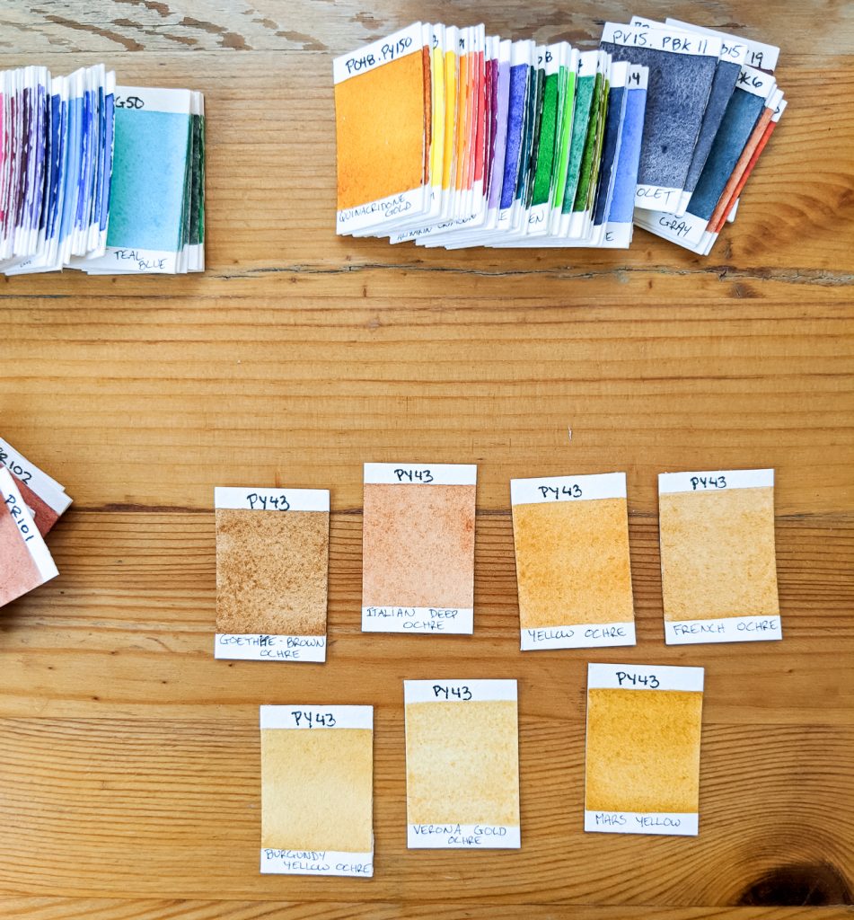
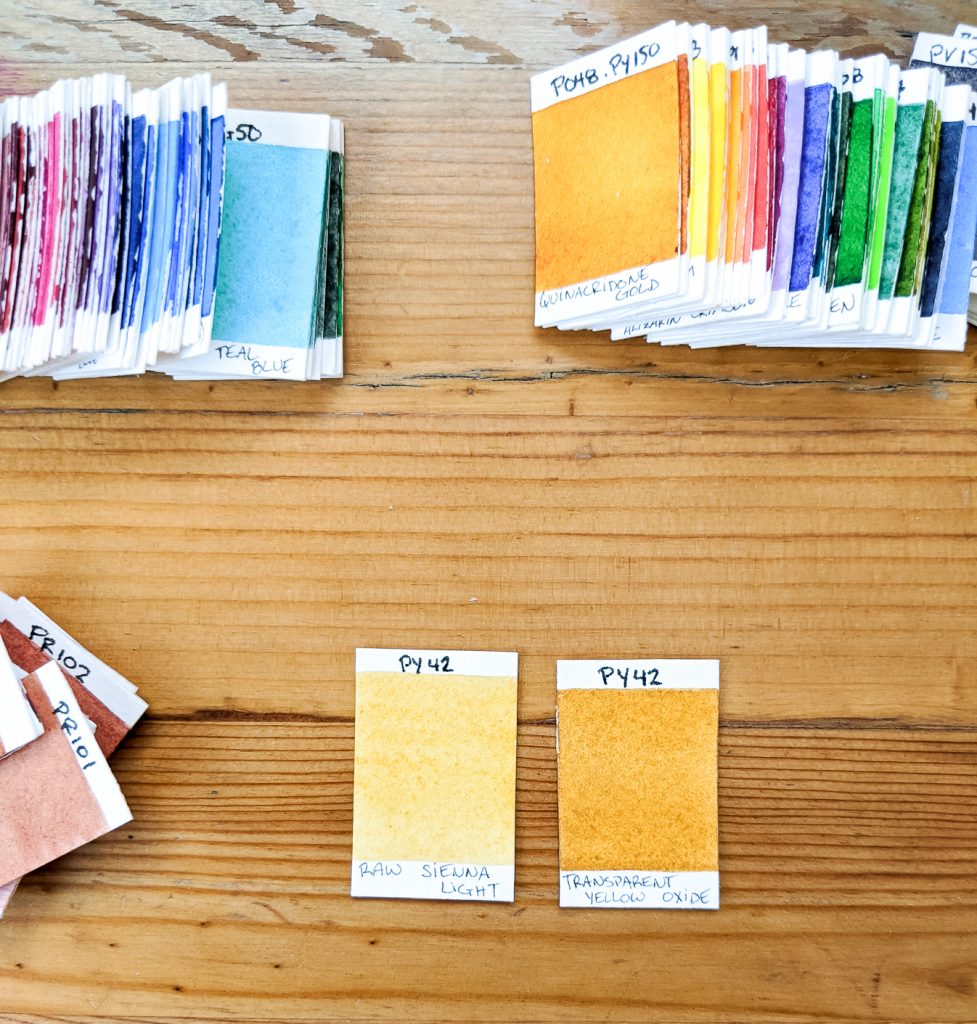
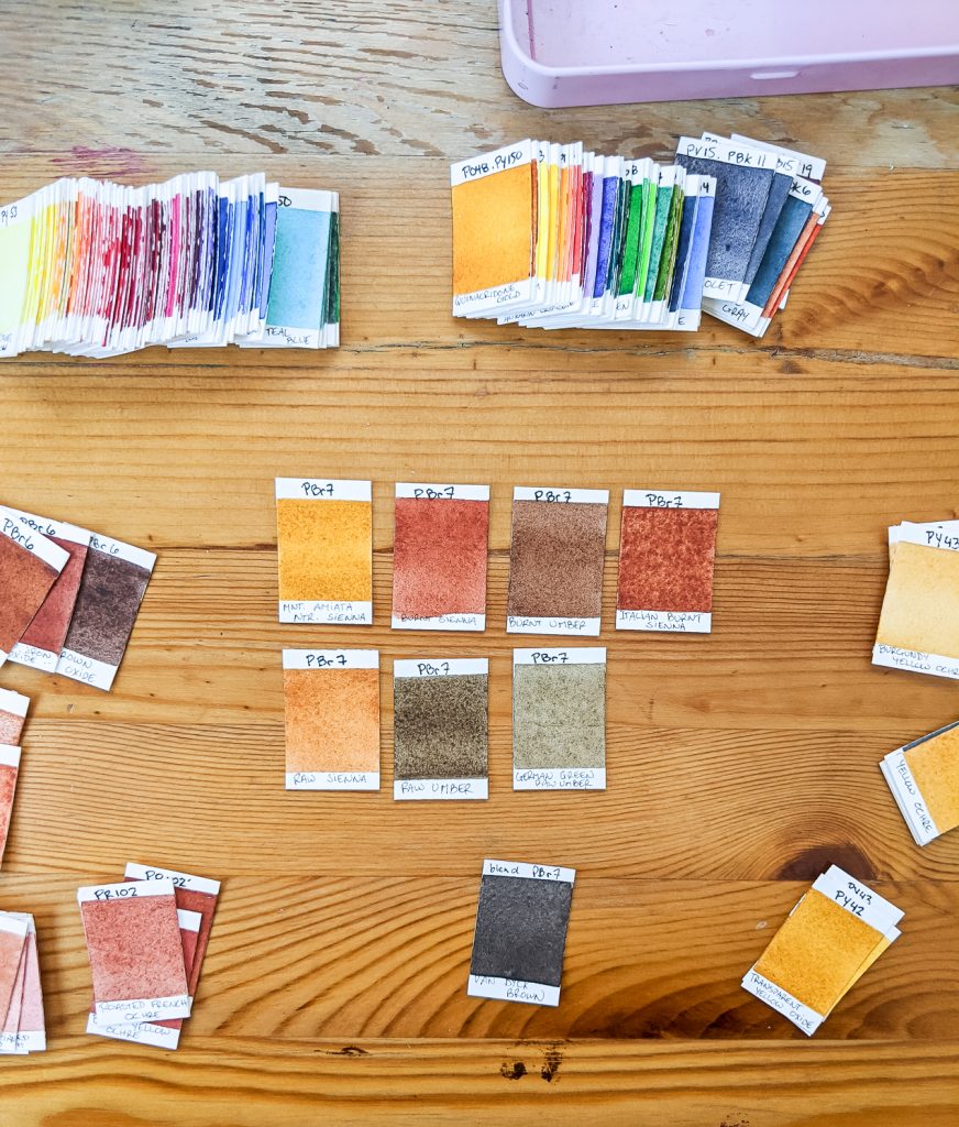
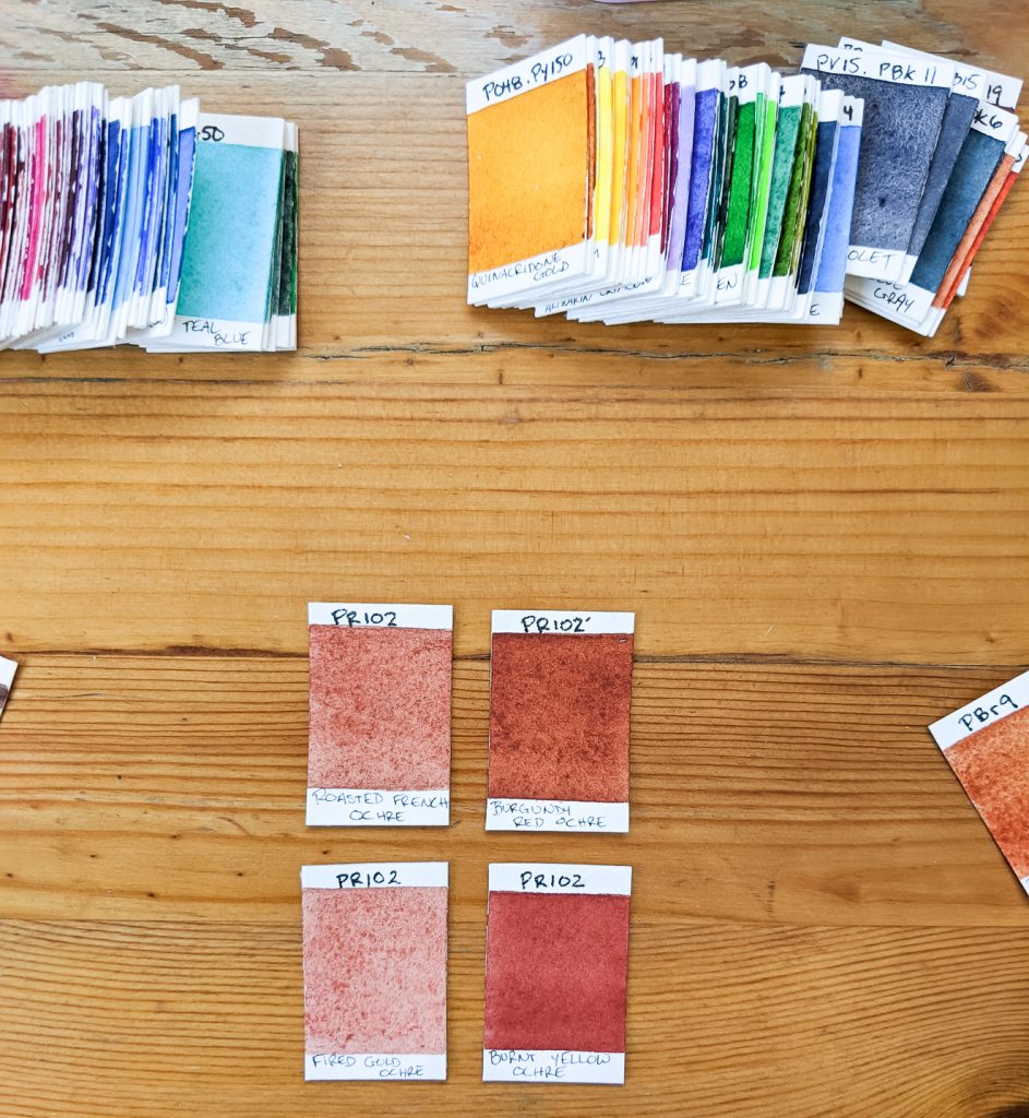
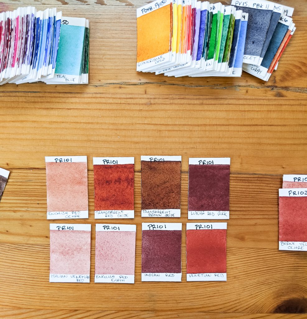
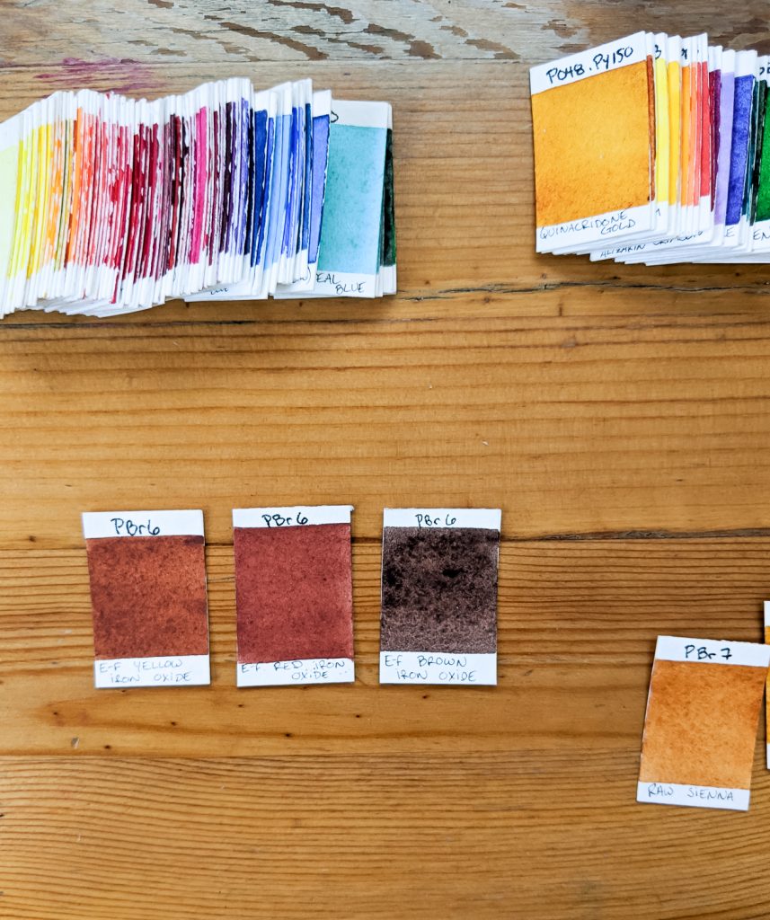
Where it gets really confusing, is when you get to PY43, PBr7, PR101 and such. For those pigment “families”, there are multiple shades. In the pictures below, I grouped the swatches by pigment number. And you will see some big variations between them! (please keep in mind those pictures might not be totally calibrated, but pay attention to the difference between the swatches rather than the colors itself).
A complicated mix!
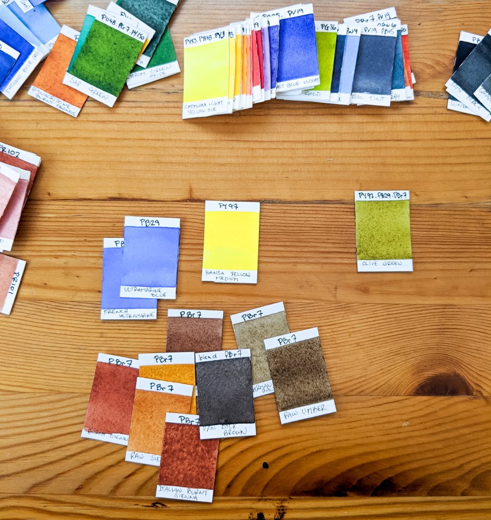
So let’s take a complicated example: Olive Green. The info on this tube of colors is that it is mixed with PY97, Pb29, PBr7. So great, if I want to save some money, I’ll grab these three tubes. I’ll be able to mix this olive green color and probably many others, right?
Only problem is there are two PB29 in the Daniel Smith’s line and seven PBr7, wight if you count Van Dyck Brown that is a mix of all of those itself. And who says the pigments that go into the mix are the exact ones going into the making of this olive green? You see where I’m going with this?
Word of the end?
I believe this exercise has made me understand colors better. I love warm yellows and I love colors that are mixed with warm yellows. It would make sense for me to stock up on tubes of single pigment warm yellows.
I also love colors mixed with such yellows. So with a few chosen colors, I might end up being able to mix tons of superb hues that I will use and love.
However, convenience mixes are there for a reason. And if you look at some colors like that Olive Green, if it is a color you love to use, by all means jump on the convenience tube because seriously, you might get a little frustrated mixing to match that perfect shade! Especially if you ever use the wrong mixing color…. 😉
What do you think?

This is a brilliant post! I love how you take us through your work and thought process, and how you’ve illustrated it using all these swatches! I agree with many of your points and thoughts and the almost scientific approach to this makes it so interesting to read. The nerd in me is very happy 🙂😁
@ilsea.art
Hey Ilse. I love that you see an almost scientific approach to my experiments. That is why I try to do. If not, I get lost and im not able to reproduce the effects …
I am also a happy color nerd! 😁
Awesome article and very informative read. Thank you for this Stephanie!!
IG: @_mommi3_
You are very welcome!! It is so fun to share my experiments with you all!